


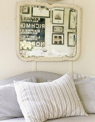
 My friend Wendy Lewis and I were chatting the other day. Wendy is the owner of Textile Trunk, one of the largest importers of Antique European Fabrics in the US. We got to talking about Antique French Ticking (isn't it fun to have friends you can have long conversations with about French ticking!). Anyway, I said "So I guess French Ticking is really coming back into style, eh?" (trying to sound so cool and 'in the know') Wendy gently replied "Oh, Gina, French ticking has NEVER gone OUT of style. Why just about everyone wants French Ticking fabric - especially in the Spring!" "Yes", I said quickly (and with a slight English accent, so I would still sound hip and stylish) "It's simply a classic, Darling!" We both had a good laugh!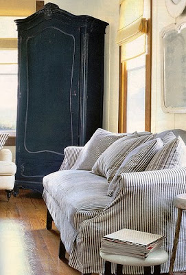
And of course when I really thought about it - French Ticking IS a classic. Perhaps that's why we see it everywhere, year after year! So, I decided to look back in my inspiration files. Both photos above are from an older Country Living issue. Blue and white is the most classic ticking. I love the straight lines of this slipcover - no ruffles - good choice.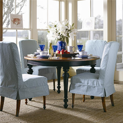 I suppose Ticking is so popular in the warmer climates (and in Spring) because it has a certain crispness and lends itself well to beach decor. In this photo from Coastal Living, we see blue ticking slipcovers again on the dining chairs.

 I suppose Ticking is so popular in the warmer climates (and in Spring) because it has a certain crispness and lends itself well to beach decor. In this photo from Coastal Living, we see blue ticking slipcovers again on the dining chairs.
The photo above from Cote de Texas, we see yellow ticking on the banquette. Even in this more rustic setting it adds a certain freshness.


French ticking originated as a utilitarian fabric used to cover mattresses, pillows, and daybeds. An extremely durable fabric it was originally woven to withstand heavy use and had a traditional heavy weave and straight line pattern. According to Wendy, antique pieces can still be found as early as the 18th century. In this room above from Country Living we see the ticking on the pillows and on the box spring. I really like how this looks - subtle but a very nice touch.
 (cote de texas)
 Here you see more contemporary ticking used as a duvet cover. In both examples you see that the fabric looks as wonderful mixed with beadboard and painted furniture as it is does mixed with denim and sisal.
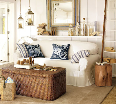 French ticking is the perfect compliment to sisal and sea grass and lends itself wonderfully to classic coastal decor. I adore this room from Coastal Living! Notice the wood stump table, rattan coffee table, hanging lanterns and mirror. What a beautiful room for a beach house.
 (cote de texas)
The classic ticking colors are red and blue - These pillows are a great addition to this sofa!
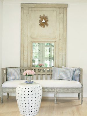
Faded blue ticking looks simply perfect in the Swedish style home. Here in a popular shot from Veranda, Shannon Bowers sits them on her gorgeous Gustavian bench.
(living etc)
Antique French ticking also looks divine on antique french furniture. I just adore the look and feel of this piece.
 (cote de texas)
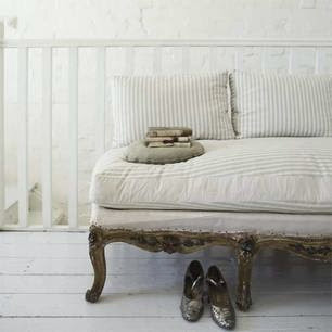
A French sofa with antique French ticking. It looks so soft and pretty.
 (mary makarie)
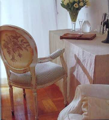
The ticking on this chair looks new - but the floral fabric looks antique - An interesting mix
 (haunt)
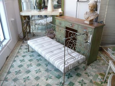
This iron daybed looks so sweet covered in ticking. Notice how perfect the stripes run on the sides of the cushion. Very well done.
 (things caught in Michael's eye)
Here small antique pieces of French ticking are used in a patchwork design to cover this settee. It looks marvelous in this loft like setting.
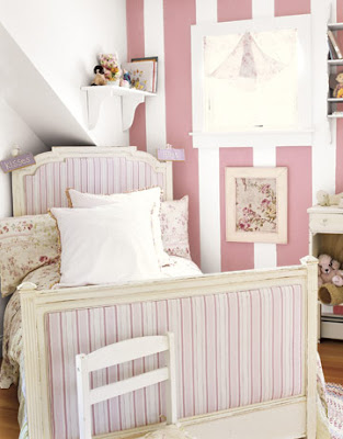 (Country Living)
French Ticking in a child's room looks sweet and inviting.
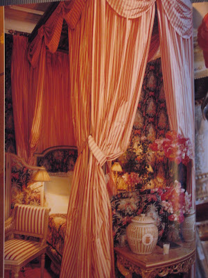 (peak of chic)
But, it is not just used just in coastal, beach and informal settings. Here designer Carolyn Roehm, drapes a bedroom and French ticking takes on a much more luxurious feel.
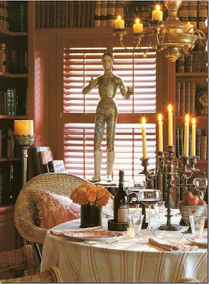 (cote de texas)
A bit more serious and formal,you can see that this table draped in French ticking, becomes more sophisticated.
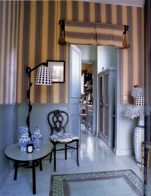 Used as a wall treatment and drapery fabric, this room from Peak of Chic, shows how French ticking can stand up to the most elegant architecture.
(Veranda)
But, for most of us, just a few pretty pillows mixed in with what we have will do.
(nskwood)
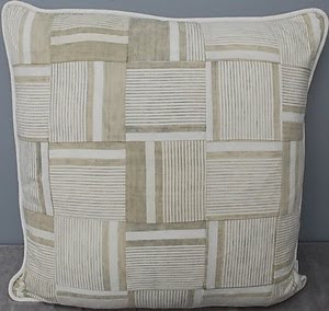
Here antique pieces are patch-worked into beautiful works of art. Note the ticking bench cushion as well.
 (eurolinens)
Here is another antique ticking pillow. This one is so pretty - the patching technique allows you to hide any stains and use as much of the remnant piece as possible.
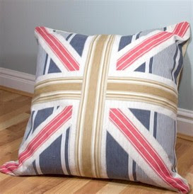 I had to include this wonderful design from Freckles and Bird in the UK! What a fun pillow!
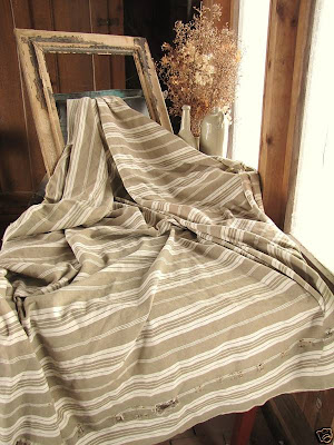 If only I could sew! You can find ticking in any fabric store, but for something really unique and beautiful check out Wendy's antique French pieces - They are so gorgeous. This is just one of many she has listed on her website, Textile Trunk- click here
.
I guess its pretty obvious that French Ticking is as popular as ever and here to stay. It works in almost every decor and setting. So next time someone asks you what you think about French Ticking you can say, "Oh Darling, it's a CLASSIC" (just try to use your best English accent!) 
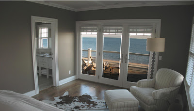
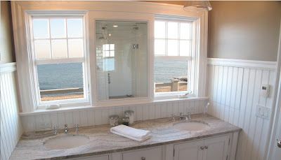
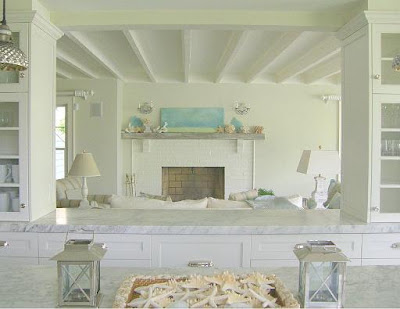 I love to find designers who have a look and style that is fresh and fun, but also traditional. Designers who have a coastal look that is so wonderful and leaves you wanting more.
 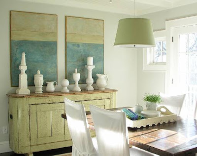 So I was thrilled to be reacquainted with the work of Molly Frey from Marblehead, Massachusetts via
 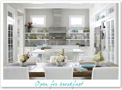 I say reacquainted because I had also seen Molly Frey's work via
 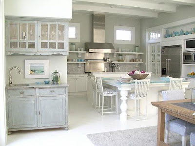 When I went to Molly Frey's


 Here is the breakfast room after!


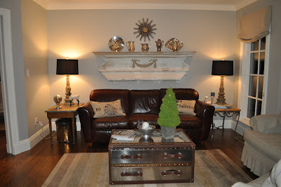


 We added a gas



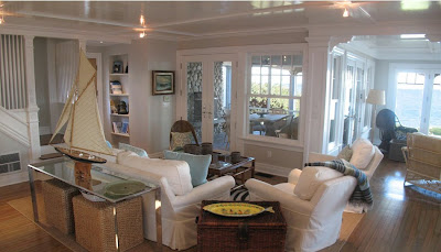
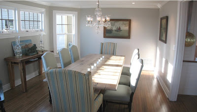
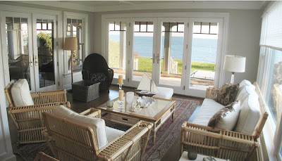
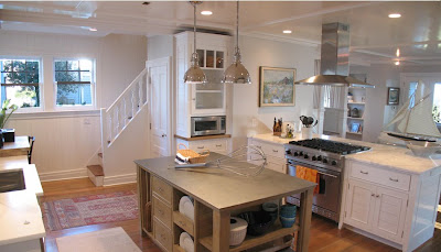
 Finally the wonderful outdoor screened porch. It really is a room of its own with the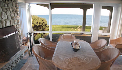
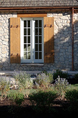 See you then!


